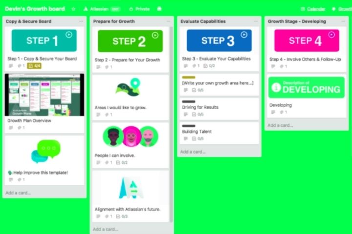
At Trello, innovation meets playful elements. Here, organizing means designing a kind of board together. Projects, posts, discussions, chats, and more run on cards that can be dragged and dropped from one list to another on the whiteboard. In this way, cards can be passed between categories and the workflow can be clearly visualized.
Cards are interactive – you can link team members to a card so they can participate. They can also contain information in different formats: texts, images, chats and links to the most important functions.
Trello does not switch tabs in the browser when a card is opened, making this project management software intuitive and easy to use. So – called power-ups , that is, integrated applications, can be added to the cards . With Giphy, for example, you can assign each card an image file to make it stand out and make it even more eye-catching.
However, in the free version of Trello only one power-up can be activated, which considerably limits the functionality of the web tool. To avoid this limit, it is necessary to purchase a ” Trello Business Class ” plan
Table of Contents
Advantages
- Easy to use
- Very intuitive card system
- Attractive design with a fun twist
- Allows multiple boards and members in the free version
Drawbacks
- The free version only allows you to integrate a power-up
- No option to assign subtasks across cards / projects
- Quite rudimentary calendar function
Basecamp
Basecamp is presented as a comprehensive solution for companies . The user interface is as clean and intuitive as Trello, but the individual functions are much more comprehensive, to the detriment of the ease of getting used to the tool. Basecamp is suitable for all types of teams, small and large. It is one of the best trello alternatives.
Due to the wide range of functions, some training is required to use the platform efficiently. However, this learning may be worth it: Basecamp is powerful project management software. In return, Basecamp only works with paid plans, with a 30-day free trial period.
Once you have set up your profile you will find a rather spartan user interface . Each team and each project has its own page, which can be accessed from the home page. In addition, there are links to personal tasks, bookmarks, appointments, and a search function to help you find a specific task or project.
If you click on a team or project, you will get to the corresponding page from which the team or project is managed.
From the team page you access all essential functions and a personalized and pop daily feed that summarizes the most important news of the day and tasks for the team. Features you’ll find include chat rooms designed for quick communication, forums to share more content, to-do lists and a structured work calendar, a media center, and automatic billing. Project pages are almost identical to team pages.
You can use the top navigation bar to send short messages to members (“pings”). Similar to social media, there is also a notifications button, which can be customized. For example, you can turn off notifications during your free time. Under “Activity” all past activities are summarized in a clearly structured schedule. This is the best way to see what happened in the app during your absence.
Basecamp can only be tested for one month for free, after which you have to purchase a paid plan.

